
Hybrid HR Watch & App
Designing for IOTs: Working with Fossil's edgy new Hybrid HR and the creation of its white label App experience.
![]()
Delve into my exciting journey of designing user experiences for Fossil's Premier Hybrid HR Watch and its accompanying white label app. The challenge was to create a seamless and engaging interface that could be branded by over a dozen prestigious fashion brands, ensuring a cohesive user experience across different brand identities. In addition, focusing on the experience design of the Fossil Hybrid HR watch itself, co-locating in the Silicon Valley with a talented team and collaborating on an intuitive and visually compelling interface that seamlessly integrated with the App.
My Roles
For this project I assumed the following roles:
- UI Designer
- UX Designer
- UX Researcher
Deliverables
Full "DIANA" HR App Prototype as well as all of our initial watch face screens For the actual Hybrid HR Watch.
Product Design:
- White label App UX (both smart, HR & hybrid watches)
- White label visual design and branding for 12 fashion labels
- Creation of a smart watch face design library
- Device as well a app user flows
- Hardware spec douments
- High-fidelity mockups and prototypes
- Competitive analysis
Specifications
Project duration || 2.50 years
Tools:
- Sketch || Craftt || InVision
- Photoshop
- Illustrator
- After Effects
- In Design
- Jira
Background
Fossil's Aquisition of MISFIT
In November of 2015 Fossil announced that it had an agreement to acquire Misfit, Inc., an innovator in wearable technology and stylish connected devices. The acquisition will enabled Fossil Group to expand its addressable market, offering consumers both traditional timepieces and fashionable connected accessories. Misfit brought to Fossil Group a scalable cloud and app platform, a world-class software and hardware engineering team, a native wearable technology brand and a pipeline of innovative products.
About the Hardware
Hybrid HR is a digital-analog smartwatch for fashionable consumers who want awearable with contextual smart functionality and classic style. It offers the most important information at a glance while also giving customers convenient control over their smartphone. Diana is an expressively designed watch built to get you up and moving with health coaching. Uniquely, it features a full round E-Ink display that allows you to get notifications from the people and services that matter. It also has theglanceable complications and add a series of immersive on-watch apps.
Hardware Product Pillars:
Glanceable Content, Health & Wellness, Easy Interaction, Long Battery Life, A Crafted Look

Above: Demos offering the most important information at a glance while also giving customers convenient control over their smartphone.
The App (aka Project Diana)
Diana is a digital-analog smartwatch for fashionable consumers who want awearable with contextual smart functionality and classic style. It offers the most important information at a glance while also giving customers convenient control over their smartphone. Diana is an expressively designed watch built to get you up and moving with health coaching. It features a full round E-Ink display that allows you to get notifications from the people and services that matter. It also has theglanceable complications and add a series of immersive on-watch apps.
- How might we create a meaningful app experience without constantly drawing users back to the app?
- How might we create delightful moments within the app that can carry over into the device?
- How might we improve the app experience to motivate users to return to the app?
Proposed vision:
- Build a web-based tool that auto dealers use on a daily basis
- Enable users to get the best deal and fast
- Elimation of phone calls to RMs
- Enable speed, security and hunamization
Discovery approach
Note: Initially, an agency had been hired to undertake this project but was subsequently defunded. However, we were fortunate to have access to the majority of their discovery work, initial research, and rough ideation..
- Composed a list of featutres based on business priority
- Reviewed the previous discovery docemtation
- It made sense to repourpose some the previous team's components/solutions.
- Copius Mural ideation
Addressing this pain point by implementing an online ordering system or a digital platform could significantly improve the experience and enhance the ability to serve customers effectively.
Challenges
Most of the prior research was conducted on a South American user base, which was no longer applicable.
- Our MVP was now going live in Europe (not South America)
- While there might be a fair amount of similarities, our user was European
- We did not feel comfortable making assumptions
- We made the time to conduct surveys, interview calls to generate an accurate user persona
- Conducting regular user testing posed challenges due to time zone differences and a limited user contact base

Above: An initial flow I created to ensure clarity and provide the business with a high-level understanding of the user journey.
User-centric e-Commerce: embracing best practices for optimal experiences
One common desire among all consumers is to have a quick, easy, and informed path to purchase. Personally, I understand the frustration when finding a product, adding it to the cart, and checking out becomes challenging. It is crucial to prioritize a self-serving approach to reduce bounce rates, customer support requests, and abandoned carts. A well-designed e-commerce user experience aims to guide shoppers through the process effectively. This not only enhances traffic and conversions but also builds trust in your brand. While not all retailers require a convenient app with one-click buying, there are basic e-commerce best practices necessary for a great online shopping experience. For this Agriscience merchant, our focus was on these fundamental areas to ensure a successful online shopping experience.

Above: An initial flow I created to ensure clarity and provide the business with a high-level understanding of the user journey.
Exploring essential fundamentals for project success
- Build sales funnels, not webpages
- Transparency leads to trust
- CTAs must be clear and concise
- Have an exit intent pop up
- Use shopper feedback to become better
- Consider a custom 404 Page
- Simple, one click, secure check out process
- Strategically organized navigation menus
- Removal of unnecessary process steps
The key to success for eCommerce retailers is to provide an exceptional user experience and customer service. We need to put our customers first and ensure that they don’t go through any trouble while trying to buy from us.
Understanding our user
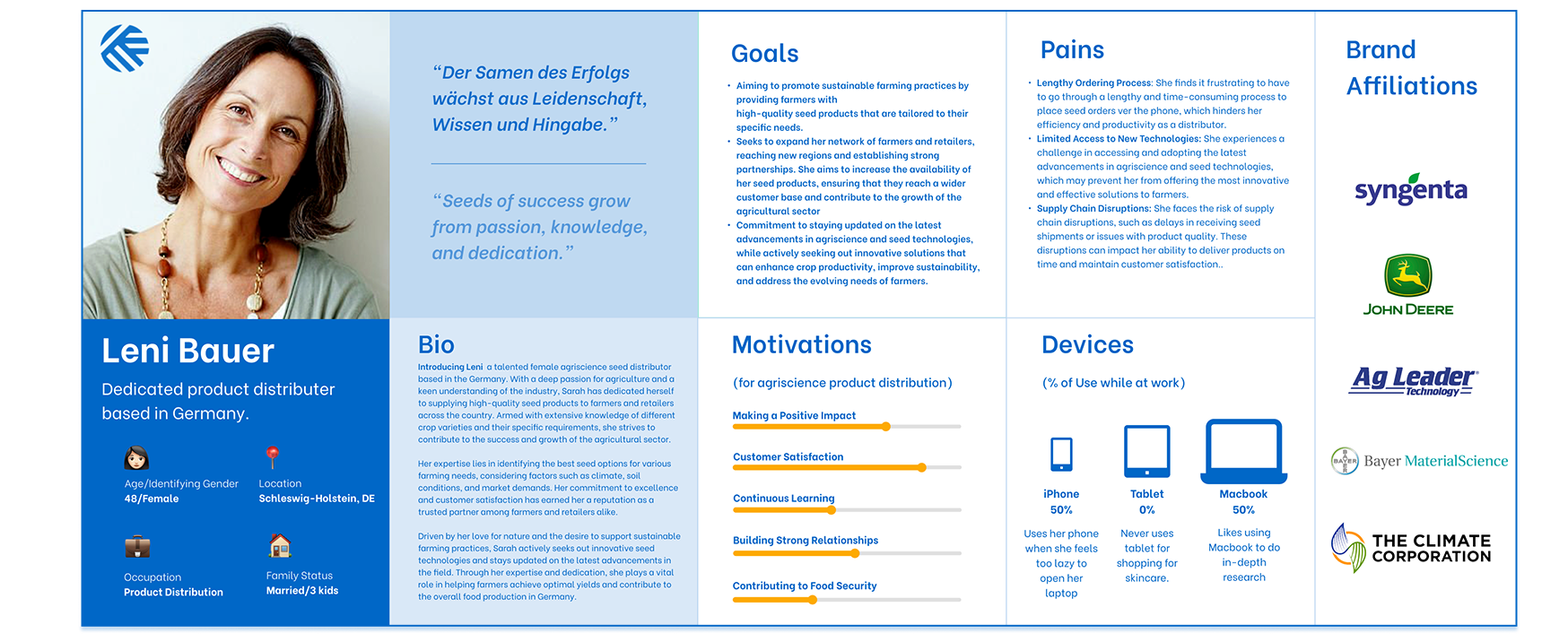
Insights, understanding and cultivation of empathy
Through the research conducted, it can be concluded that Leni is a highly dedicated and knowledgeable professional in the agricultural industry. Her expertise in identifying the best seed options and commitment to customer satisfaction has established her as a trusted partner among farmers and retailers.
However, a pain point identified during the research is Leni's frustration with having to place orders over the phone. This manual and time-consuming process hinders her productivity and efficiency. Leni expressed a desire for a more streamlined and convenient method for placing orders.
Addressing this pain point by implementing an online ordering system or a digital platform could significantly improve Leni's experience and enhance her ability to serve her customers effectively. By providing a user-friendly interface and efficient order management features, such a solution would save Leni time and effort, allowing her to focus on other critical aspects of her business.
Generating ideas and conceptualizing with mid-fidelity wireframes
After compiling our research information, we employed mural boards to foster productive discussions and brainstorming sessions. We categorized similar ideas and proceeded to create wireframes individually. It is important to note that Coreteva had a well-established style and component library, which influenced our decision to start at a mid-fidelity level given our timeline. After concepting separately, we collaborated, compared notes, and proceeded with these initial designs. Full concept PDF available upon request.
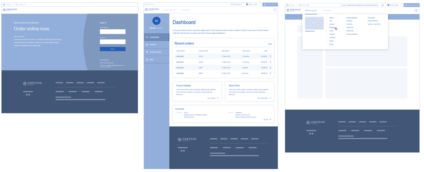
Above wires: login, user dashboard, menus
Addressing techinical contraints with design solutions and A|B testing
Test B prototyped for user testing.
Resolving the sold to | ship to dilemma:testing solutions based on backend data requirements
This particular component underwent five rounds of design solutions, driven by both business requirements and technical feasibility. To fully understand the experience, it is best to walk through it.
In order to keep the "Sell to | Ship to" information clear, we defined "Sell to" as the distributor identification and "Ship to" as the warehouse(s) where the product is destined. This information is crucial and needs to be displayed immediately after user authentication. The development team's feedback led us to reconsider our initial approach of loading this data initially.
Please review the above (Test B) prototype, which represents the strongest iteration and is the version we ultimately launched with. This will provide a better understanding of the solution.
Exploring and testing the "Quick Order" process
In developing our Quick Order feature, our focus was on designing a streamlined and efficient flow that enables users to place orders with speed and ease. Our primary objective was to minimize steps and eliminate friction points, ensuring a seamless and intuitive process. Key considerations for this feature included:
- Clear and prominent Access: We ensured the Quick Order feature had a prominent and easily identifiable access point, such as a dedicated button or section. This allowed users to bypass the traditional browsing and searching experience, saving them time and effort.
- Simplified input: We prioritized a straightforward input interface where users could enter product codes, SKUs, or other identifiers to add items directly to their cart. This simplified the ordering process, reducing the need for extensive searching and browsing. By implementing these considerations, we aimed to enhance the user experience by providing a convenient and efficient way for users to place orders, ultimately saving them time and improving overall satisfaction.
One of the simple solutions prototyped for user testing.
Development handoff
During the development handoff phase of the Global eCommerce Portal project, we ensured a smooth transition from design to development. Clear and concise documentation was prepared to provide developers with all the necessary information and assets for implementation.
The handoff package included high-fidelity comps, well organized in Zeplin including design assets such as UI elements and, images and vector graphics. We also referred them to our Style library and met very regularly all the way up until launch, ensuring consistency and adherence to the design vision.
Regular communication and collaboration with the development team were maintained throughout the handoff phase. We conducted meetings and walkthroughs to address any questions or clarifications, ensuring a shared understanding of the design intent and functionality. This team was exceptional. Sr||Lead Developer Killian Grant .
Reflection | Lessons learned
- Reminding myself that embracing the inherent ambiguity and complexity of each project is crucial, as no two projects are alike.
- Extensive research, user testing sessions, and regular dialogue with users are essential, regardless of the organization's support or funding.
- Nurturing a strong relationship with the development team and working closely with them until launch is of utmost importance.
- When there is only one stakeholder who is spread thin, it is essential to prioritize regular and meaningful communication, proactively prioritize and schedule weekly check-ins at the very least z
- The daily collaboration, experience, perspective, insight and trust of my fellow design partner on this project is what made it shine. The "UX team of one" will always produce an inferior result in comparison.
- Post-launch, implementing analytics to track user behavior and gather feedback is critical. This enables the identification of areas that require further optimization, improvement, and expansion.